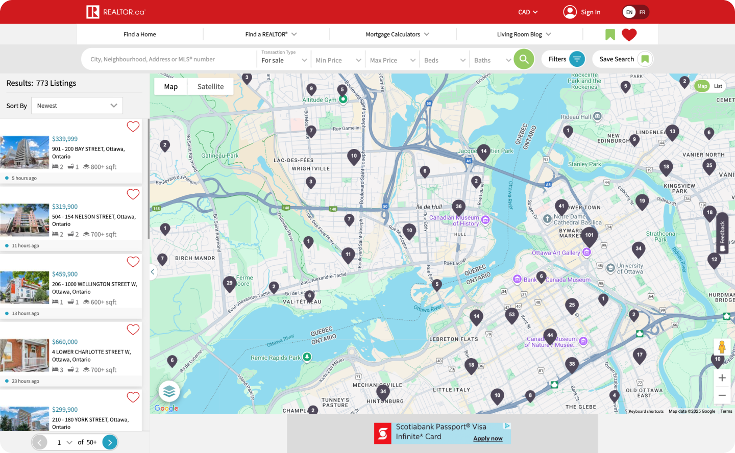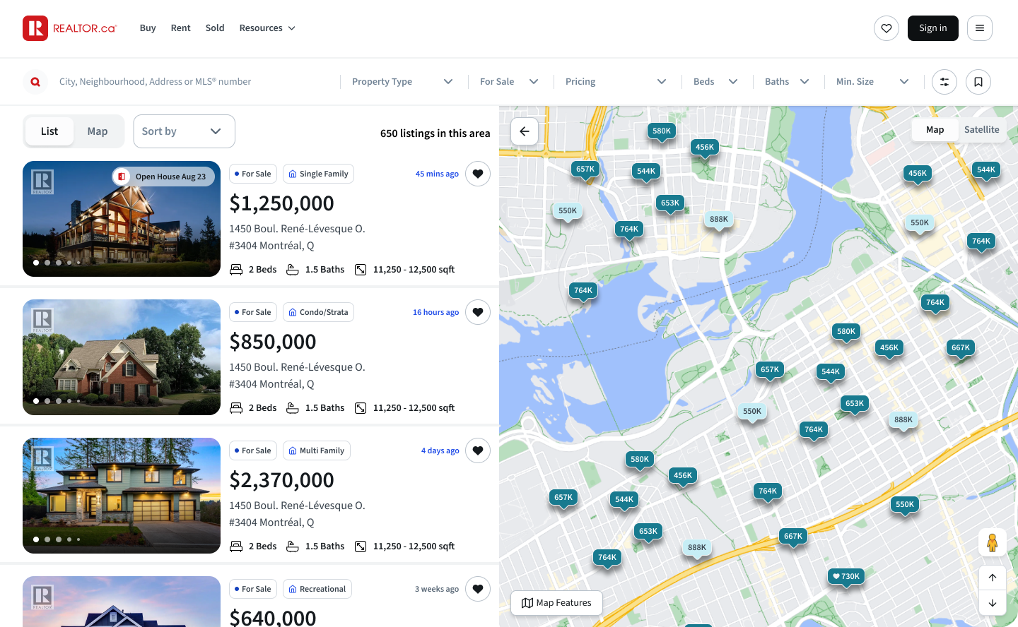
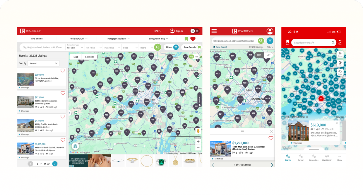
I began with a bird’s-eye audit of the entire platform. Evaluating visual pain points, cross-device inconsistencies, and the state of any existing design system. This helped me understand the true scope, timelines, and what needed to stay, go, or change moving forward.
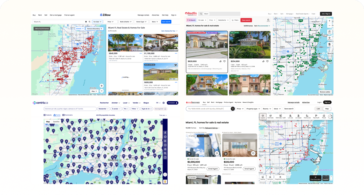
I analyzed the competitive landscape: Zillow, Redfin, Realtor.com, Rentals.ca, Centris, and Kijiji, to understand where our experience stood in the market, how competitive we truly were, and what foundational improvements were needed.
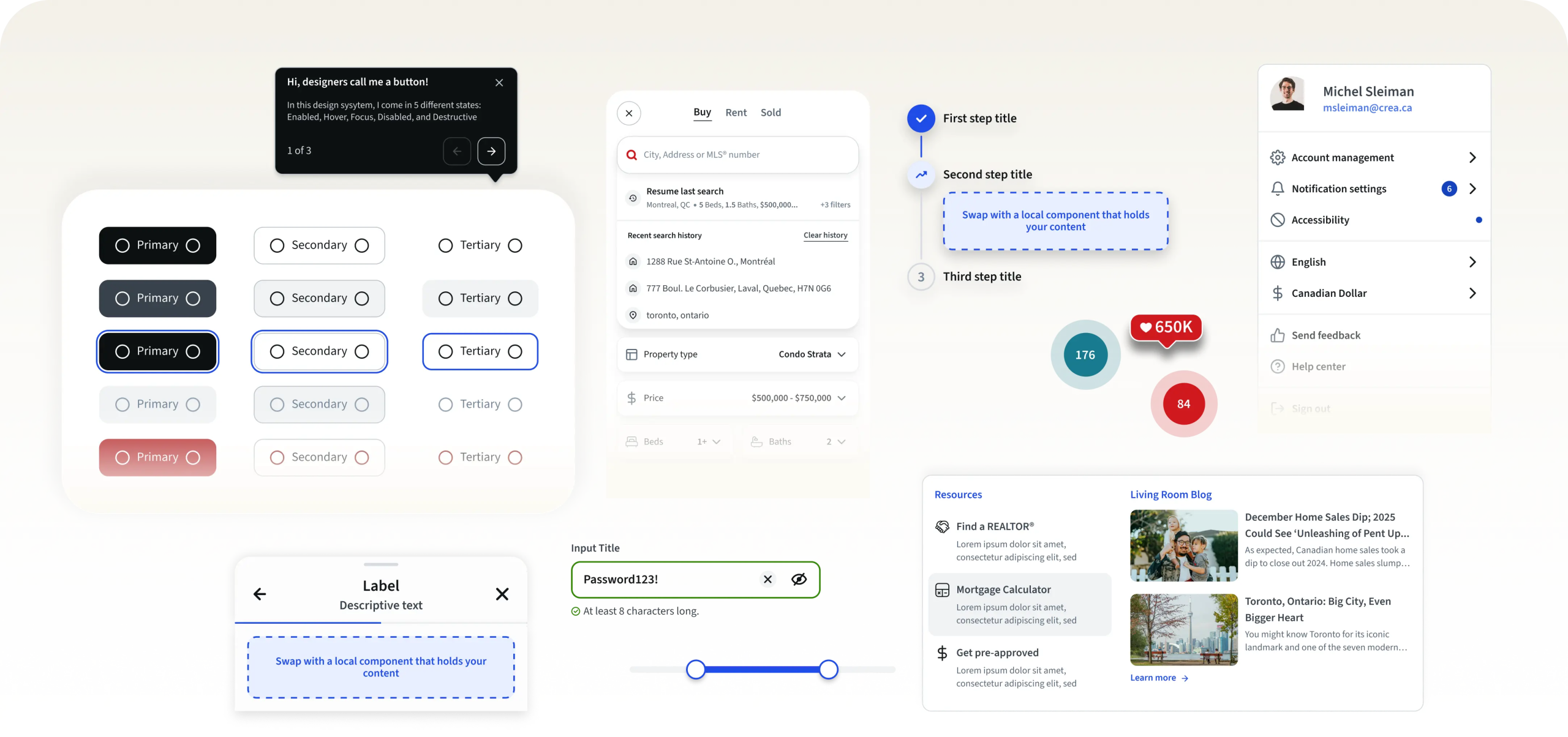
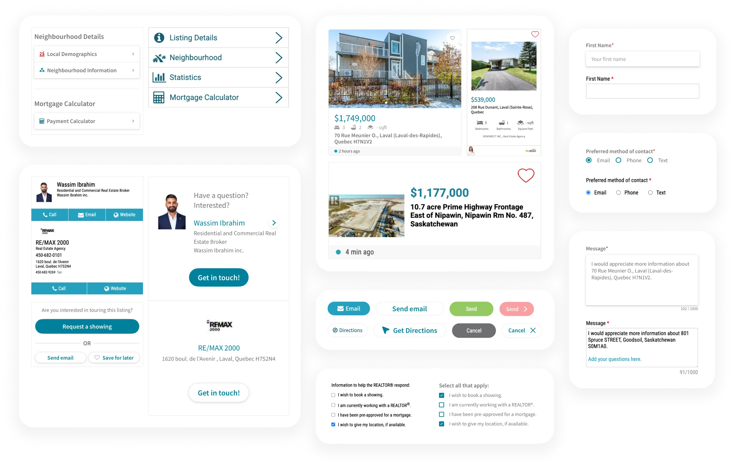
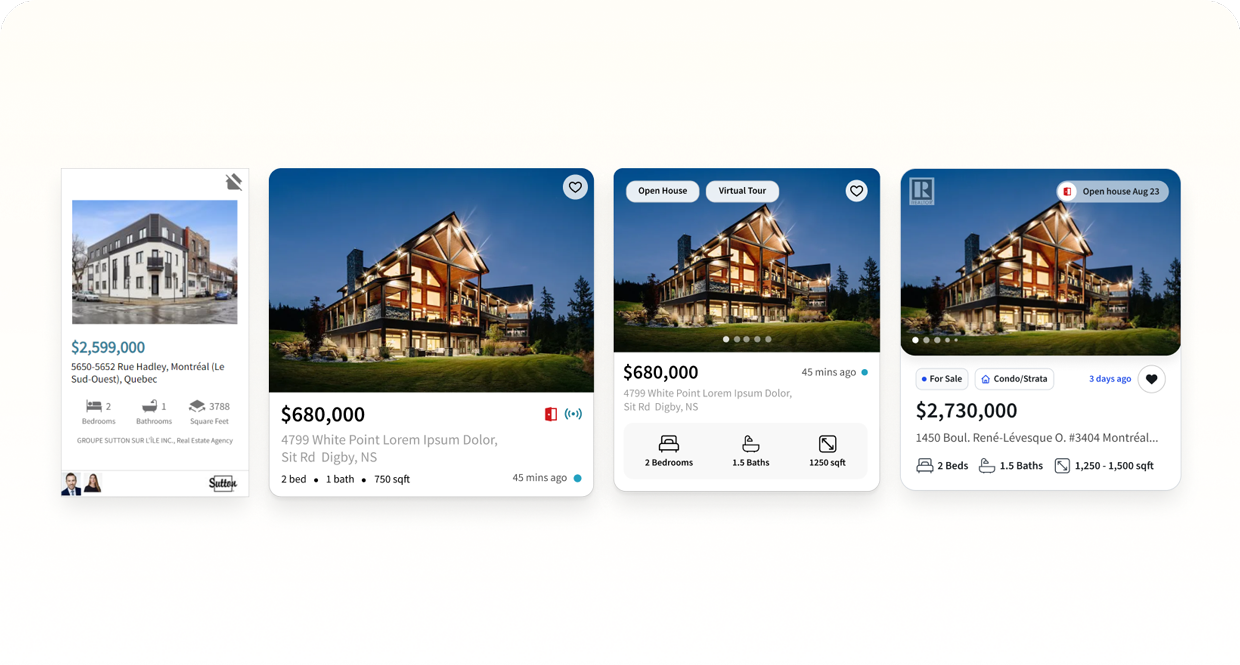
I started shaping early concepts and lightweight structures, initial components, patterns, and rules, to test what a unified system could look like.
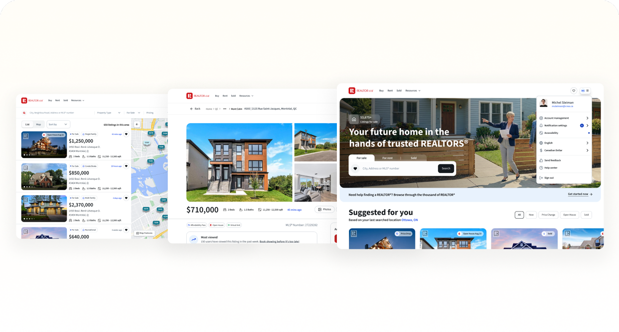
I translated the early foundations into clearer directions, creating visual frameworks and system principles to show how the new experience could come together.
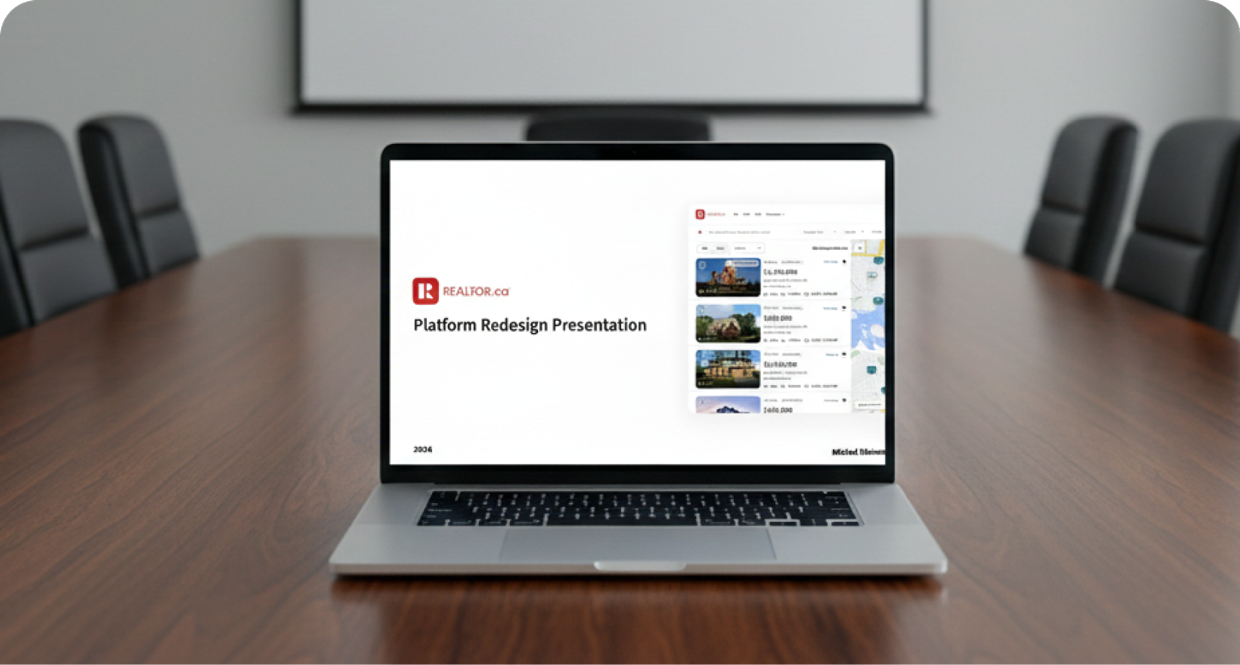
With a clear vision in place, I aligned cross-functional partners by presenting the system’s value, principles, and impact on product velocity and consistency.
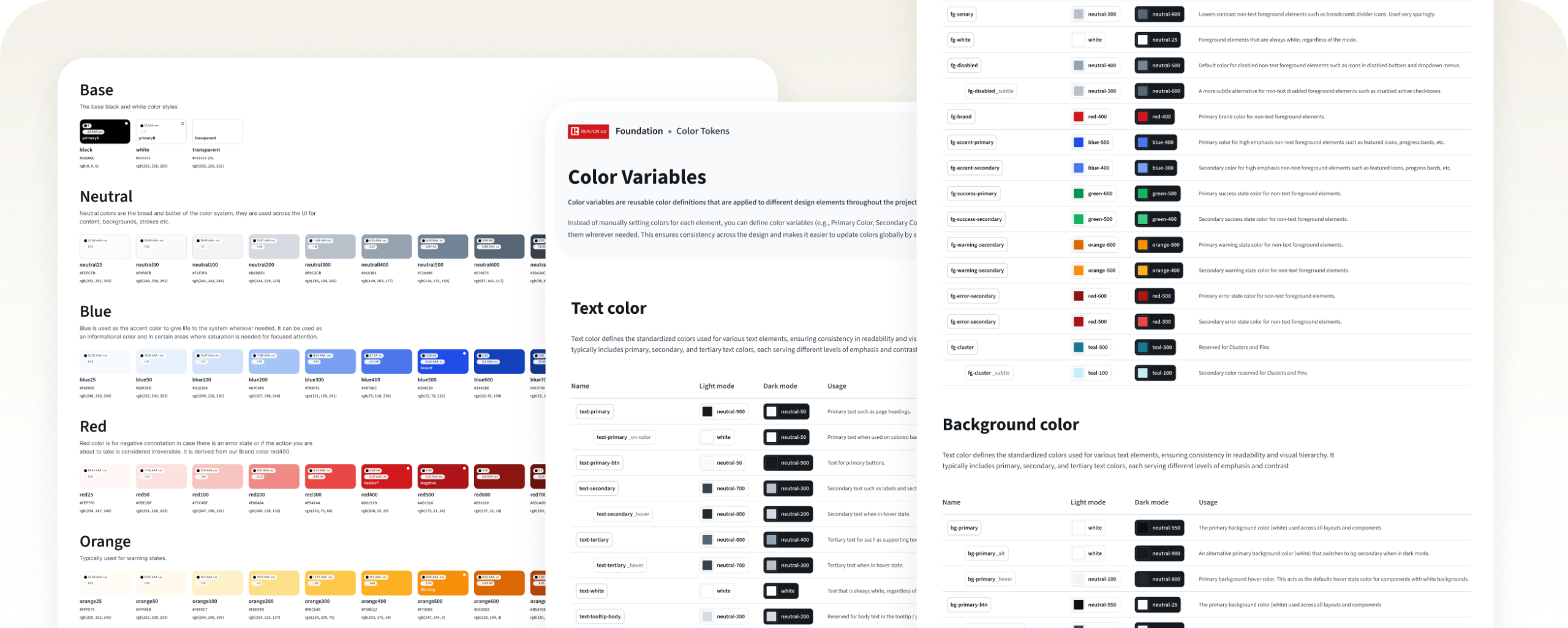
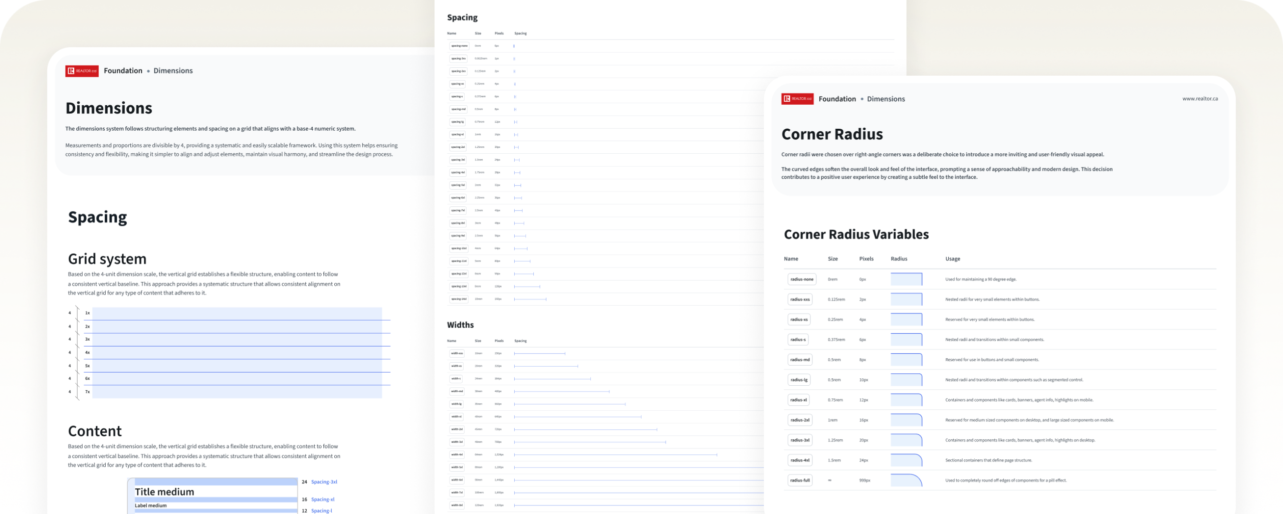
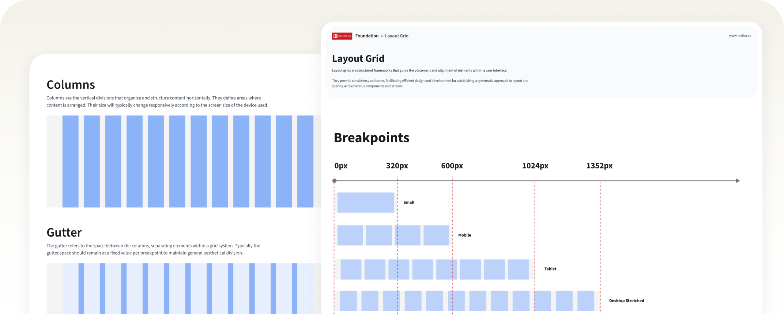
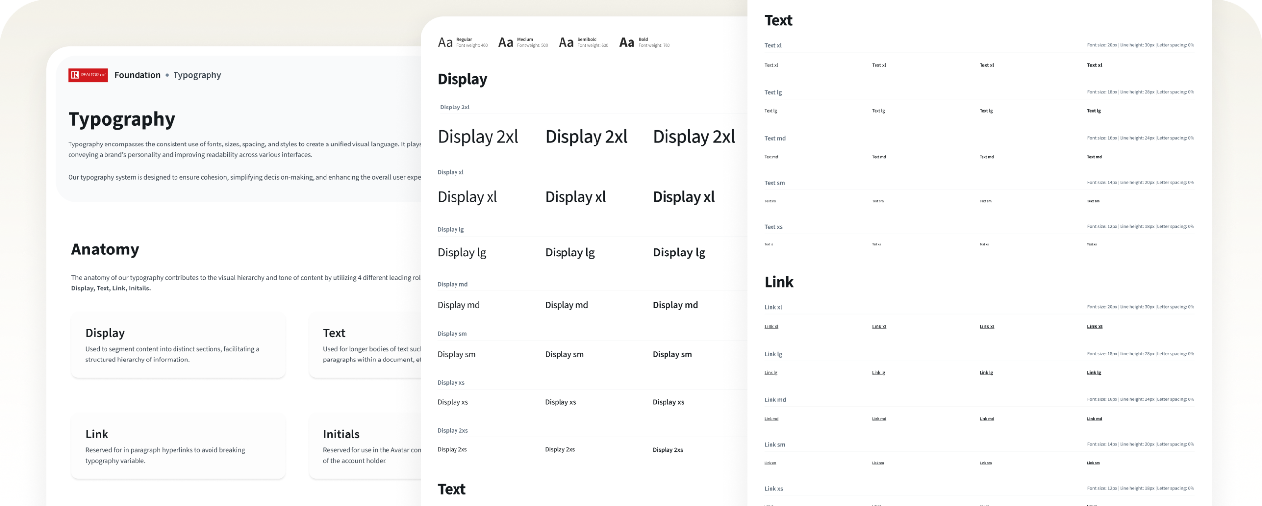
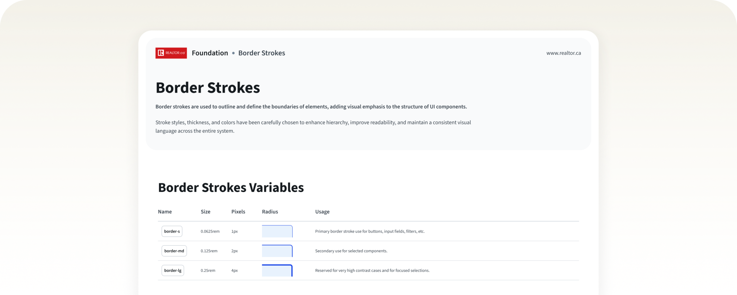
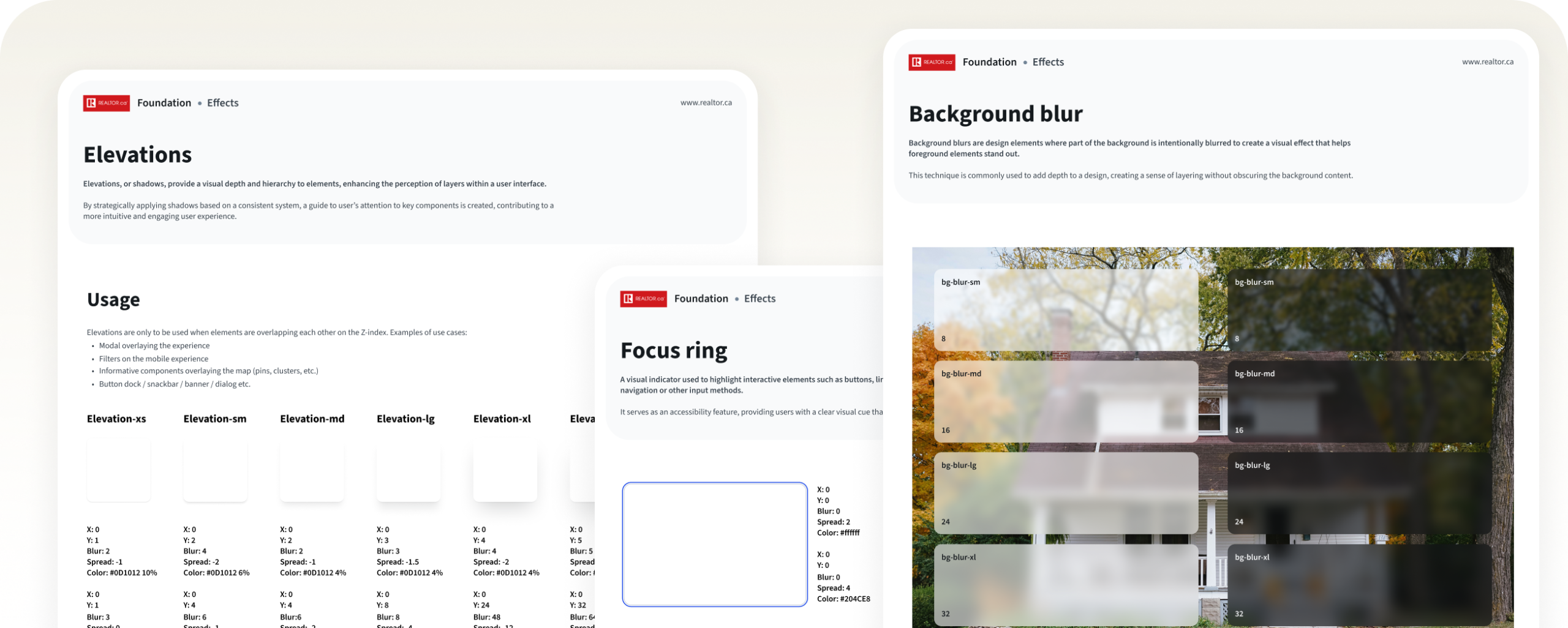
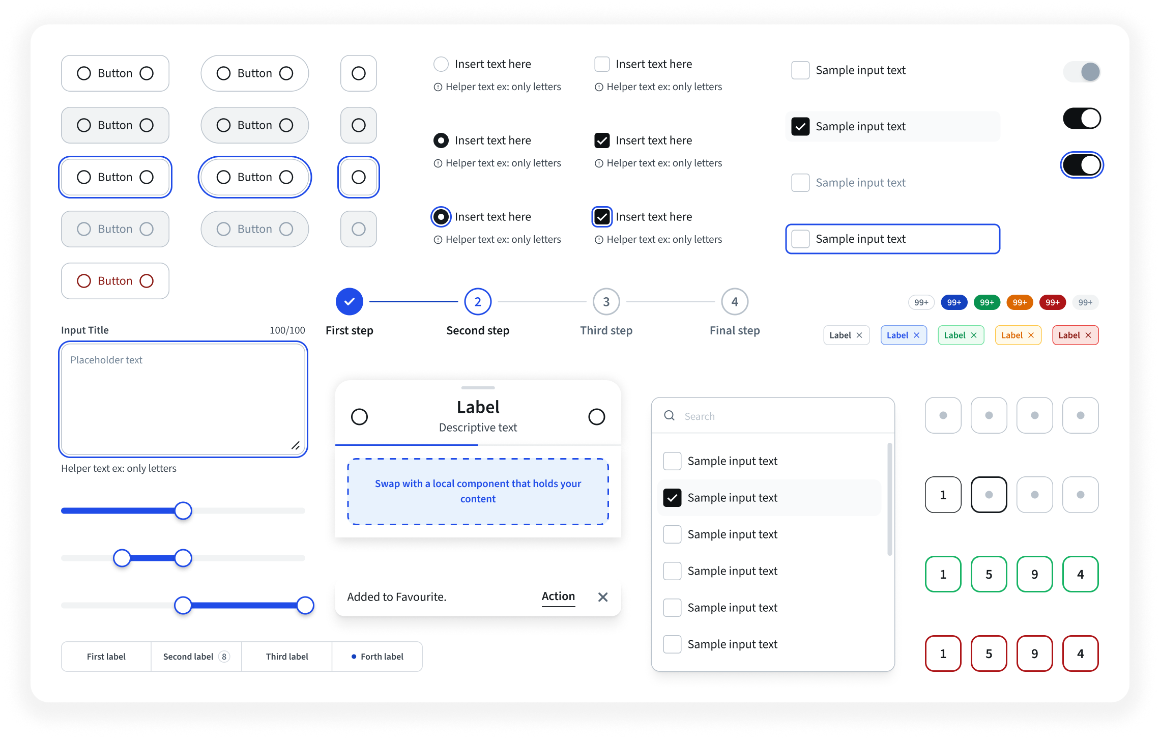
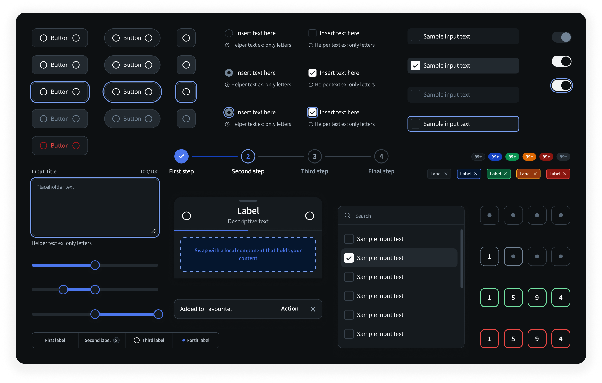
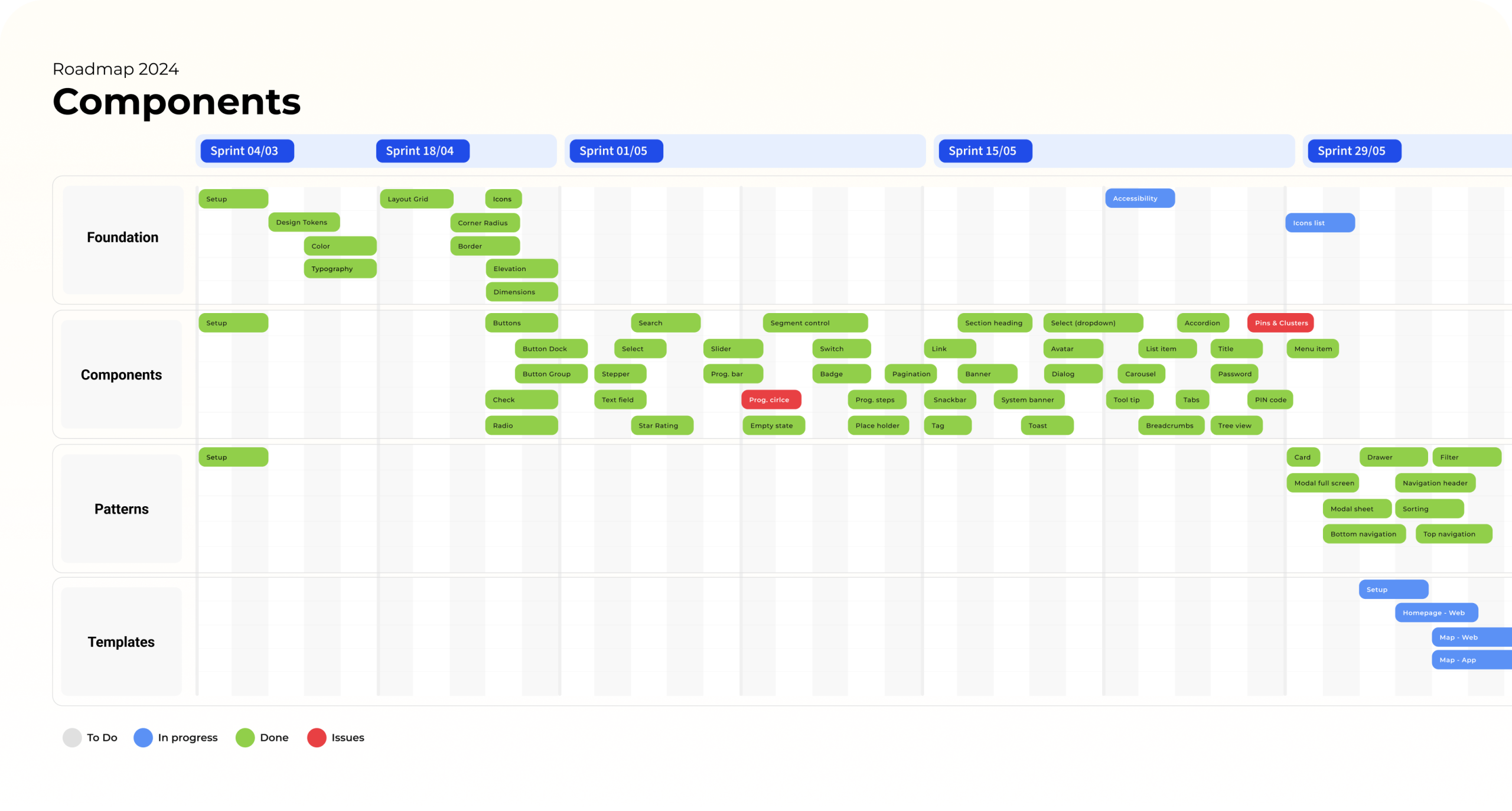
With alignment secured, I moved into full execution, building scalable components, documenting guidelines, and preparing the system for adoption. I also developed a detailed roadmap structured around two-week sprints to systematically deliver every part of the design system with clarity and momentum.